Have you ever sat through a presentation where every inch of the slide was crammed with text, images, charts, and diagrams? It’s overwhelming, isn’t it? This is where utilizing White Space in Presentations comes into play. Now, let’s delve into the world of white space and explore how it can profoundly enhance your presentation design.
Understanding and Utilizing White Space in Presentations
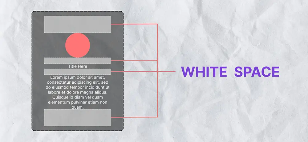
White space, alternatively termed negative space, refers to the empty areas within a slide or design. Have you ever endured a presentation where the presenter crammed every inch of the slide with text, images, charts, and diagrams?
The purpose of utilizing white space in presentations is to give the elements of your design room to breathe. It helps to balance design elements and better organize content to improve visual communication. Simply put, white space is the fundamental building block of good design.
The Clutter Dilemma
A cluttered presentation can quickly turn into a confusing mess. Cramming too much information onto a slide, becomes challenging for audiences to focus on the main points. The result? The chaos obscures your message.
Adding white space to your presentation can create a significant positive visual impact. It allows the viewer’s eye to rest and helps guide them through the content in a more manageable way. Ultimately, white space can make your presentation appear more professional and polished.
The Benefits of White Space in Presentation Design
1. Better Readability
White space improves legibility and comprehension. By giving your text and other design elements room to breathe, you’re making your content easier to read and understand.
2. Focus on Main Ideas
Ultimately through effective utilization of white space, you can accentuate your most crucial points. It directs the viewer’s attention to specific areas of your slide, ensuring your key messages remain clear and don’t get lost.
3. Enhanced User Experience
An uncluttered, well-spaced design leads to a better user experience. It’s visually appealing and less likely to overwhelm your audience.
Tips for Adding White Space
- Keep it Simple: Avoid the temptation to fill every inch of your slide. Remember, less is often more in design.
- Use Margins and Padding: These are great tools for adding white space around text boxes or images.
- Break Up Text: Large blocks of text can be overwhelming. Break up your content into smaller sections to increase white space and improve readability.
Potential Pitfalls of Utilizing White Space in Presentations
Strategically utilizing white space ensures that your design remains visually appealing and effectively communicates your message. Too much white space can make your presentation seem incomplete or sparse. Use it strategically to enhance your design without detracting from your content.
Conclusion
Incorporate white space in your presentations today. It’s a simple yet highly effective strategy to enhance your designs and guarantee that your message stands out. Keep in mind that in the realm of presentation design, what you choose to exclude can be just as significant as what you include. Happy designing!


