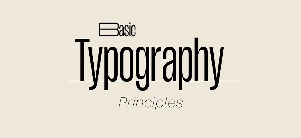
Typography is often overlooked in the design process, but it plays a crucial role in creating effective, engaging, and visually appealing infographics. Let’s delve into why Mastering Typography in Infographic Design matters and how to use it effectively in your infographic design.
The Power of Typography in Infographic Design
Typography, at its core, is the art of arranging text in a way that makes the content readable and appealing. In infographic design, typography goes beyond just readability; it helps guide the viewer through the information, enhance understanding, and create a visual hierarchy.
Proper usage of typography can significantly enhance the effectiveness of an infographic. It can draw attention to key points, evoke emotions, create personality, and reinforce brand identity. Therefore, mastering typography is essential for any designer who wants to create successful infographics.
Tools, Techniques, and Best Practices
There are various tools and techniques that designers can use to leverage typography in their infographics.
- Font Choice: Choose fonts that align with the tone and purpose of your infographic. For instance, serif fonts often appear more traditional, while sans-serif fonts have a modern feel.
- Hierarchy: Establish a clear visual hierarchy using different font sizes, weights, and styles. This helps guide the viewer’s eye through the infographic.
- Contrast: Use contrast to make your text stand out against the background and other design elements.
- Spacing: Proper letter, word, and line spacing can improve readability and aesthetics.
- Consistency: Stick to a consistent font scheme throughout your infographic to maintain cohesiveness and professionalism.
An excellent example of typography in infographic design is the “The History of Typography” by Ben Barrett-Forrest. The infographic uses different fonts to represent different periods in typographic history, creating a visual timeline while maintaining readability.
Tips for Effective Typography
While typography offers many benefits, it’s essential to use it effectively without sacrificing legibility or overall design cohesiveness.
- Keep it Simple: Avoid using too many different fonts in one infographic. It can confuse and distract the viewer.
- Make it Readable: Ensure your text is large enough to read, especially when viewing on smaller screens.
- Alignment Matters: Align your text properly. Left alignment is generally the most readable for larger blocks of text.
- Color Counts: Choose text colors that contrast well with the background for better visibility.
Wrapping Up
In conclusion, typography is a powerful tool in infographic design. It enhances readability, guides the viewer, and adds visual interest. By understanding and applying the principles of typography, you can create infographics that are not only visually appealing but also effective in conveying information. Remember, every font, size, and layout you choose sends a message. Make sure it’s the right one!


